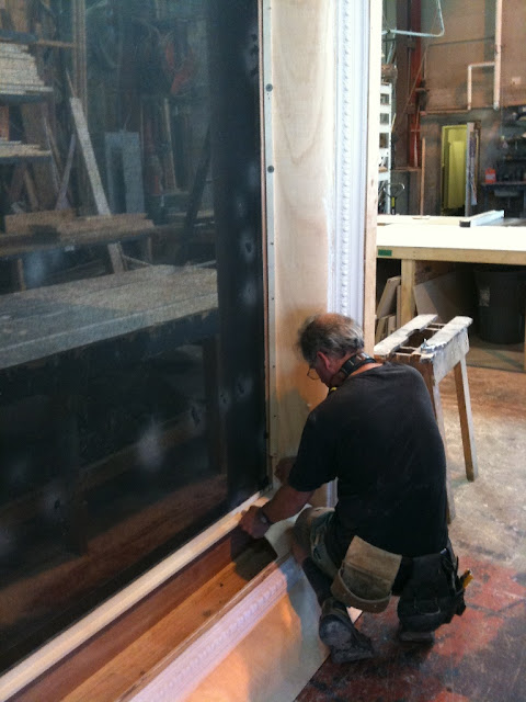
 This was a Set Design Job for the musical, "The Light in the Piazza". Patrick Street Productions produced this amazing Canadian Premier at the Norman Rothstein Theatre in Vancouver, British Columbia, Canada. The cast was amazing and the production was beautiful. This is definitely one of my favorite Set Designs to date and the Patrick Street team was such a pleasure to work for. The Show ran from September 15th - October 9th. 2011. The reviews were amazing and the audiences were brought to tears. Here are some pictures of the process of designing "The Light in the Piazza" from design to finished product. Hope you enjoy.
This Show is currently in storage and AVAILABLE FOR RE-MOUNT OR TOUR!! It travels easily and can be installed into Many locations. Contact Patrick Street Productions for more information.
 |
| Set Model for "The Light in the Piazza" by Patrick Street Productions |
 |
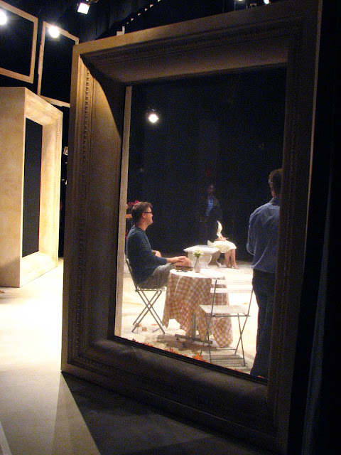
| These 2 large frame units are double sided and have wheels. They are the main set elements used to create the different locations |
 |
| Male nude bust for the museum scene. This was a custom build and is also on wheels. |
 |
| The fabric in the centre is scrim which works as a translucent barrier. |
 |
| When the light shines on the front of it, it seems solid... |
 |
| When it shines on something behind it, the image magically appears!! Very common theatrical effect. |
 |
| The set was neutral enough for the lighting to create blankets of color |
 |
| This doorway was on a fly and moved up and down. Notice the "Frame" look on all pieces. |
 |
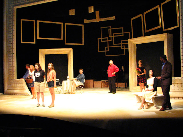
| Here we can see the scope of the false proscenium arch frame |
 | |
| The Frame theme carried through the entire set. This broken frame represented the ruins of | Rome |
 |
| This Church cross was also made of frames and stood 8 feet tall!! It flew in and out as well |
 |
| You can see behind that the band was onstage the whole time. |
SET DRAWINGS
 |
| This is the pattern design for the main arch around the stage. It was designed to look like stone relief panels found in the architecture of old Florence Italy. |
THE BUILD
 |
| Here is the mold to be repeated. Its made of wood and trim and foam. |
 |
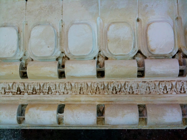
| Here are the plastic panels AFTER they have been molded and painted with the basic color scheme |
 |
| Close up on the details |
 |
| Idea of the scale of the arch. |
 |
| Here is the color scheme given to the painters. |
 |
| The Bed unit is on wheels as well and fits a standard double mattress |
 |
| Roman ruins before paint...just foam. |
 |
| The cross and frame |
 |
| Close up of Paint Treatment. Big thanks to Justice Hays for his amazing paint skills!! |
 |
| These frames did not make it to final production, but that is the nature of the beast. |
SET MODEL
Process for the MALE NUDE BUST
 |
| This started off as a store mannequin. I thought I could adjust it to make it look more organic. |
 |
| The guys at the shop attached it to the base first. It was easier to work with this way. |
 |
| I added new parts with Crayola Model Magic Compound. |
 |
| Then I did a tissue paper effect with glue and water. This is to give the paint a place to create texture. |
 |
| These genitals were a requirement from the script. |
 |
| Museum Ready.... |


4 comments:
Lance, you are so awesomely talented...you brat! love mom
Thank you Mom. Love ya!!
So impressed- Just beautiful!
What drawing program do you use for your designs?
Post a Comment