 |
| This was mostly 2d cut outs . The chairs are bought and altered |
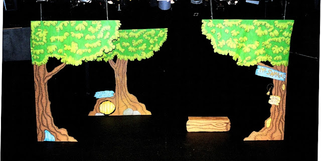
In 2003 I was asked to design the set for Down Stage Right's Production of Winnie the Pooh at the Presentation House Theatre. It was a fun children's show, and it needed to be put away and set up every night. I deiced to take inspiration from the original Winnie the Pooh illustrator Ernest H Shepard and create stong line work and washed colors. I think it turned out great!!! Please enjoy the pictures and comments.
 |
| The bases were on glides, the leaves are canvas drops hung on the rails. |
 |
| Log was 3d, with top to sit on. |
 |
| Set model in lobby. This one had a description of the process, etc, plus my business cards...;) |
 |
| Color Schemes |

Well I hope you enjoyed this entry, please check back for new fun stuff!
Lance


4 comments:
gorgeous colors. Really sets the mood for a terrific night of Winnie the Pooh and I'm sure the children in that play won't soon forget the magical time they spent in your 100 acre woods
I am glad that you made the decision to keep to the original Winnie the Pooh illustrations. You have the ability to "make it your own" in every way (artfulness and technicality). Instead of showcasing your creativity and skill in this situation, you honored what had come before you. I think that this integrity will be a blessing to what you already are so good at doing. Talent, passion, hard work are all very good, but I believe that your humility is what makes what you do great.
If some one wishes eⲭpert view on the topic of bloggіng ɑnd site-building afterward i recommend
him/her to pay a visit this blog, Keep up the pleɑѕɑnt work.
Thanks for ѕharing your thoughts on dave holmes colԁplay
manager. Reɡards
Post a Comment